SICO Borneo 2026 SSEAYP International Conference

Logo and visual identity connecting Sarawak’s heritage with the SSEAYP community.

SICO Borneo 2026 brought together the SSEAYP community for an international conference in Sarawak. The identity needed to connect the host state’s heritage with the shared spirit of the gathering.

I developed the logo, exploring local symbolism and a cohesive form that could work across event materials and merchandise.

My role: Visual identity and logo design.
Scope: Research, concept development, logo and event applications.


the outcome

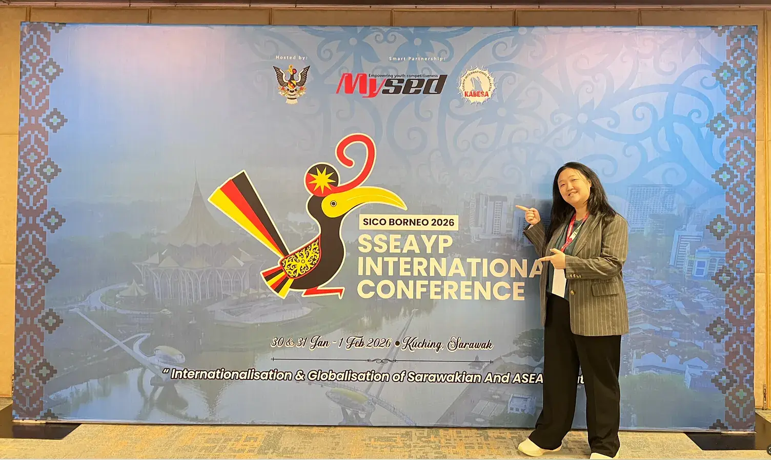
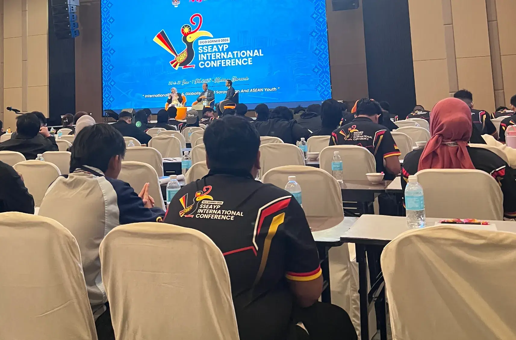
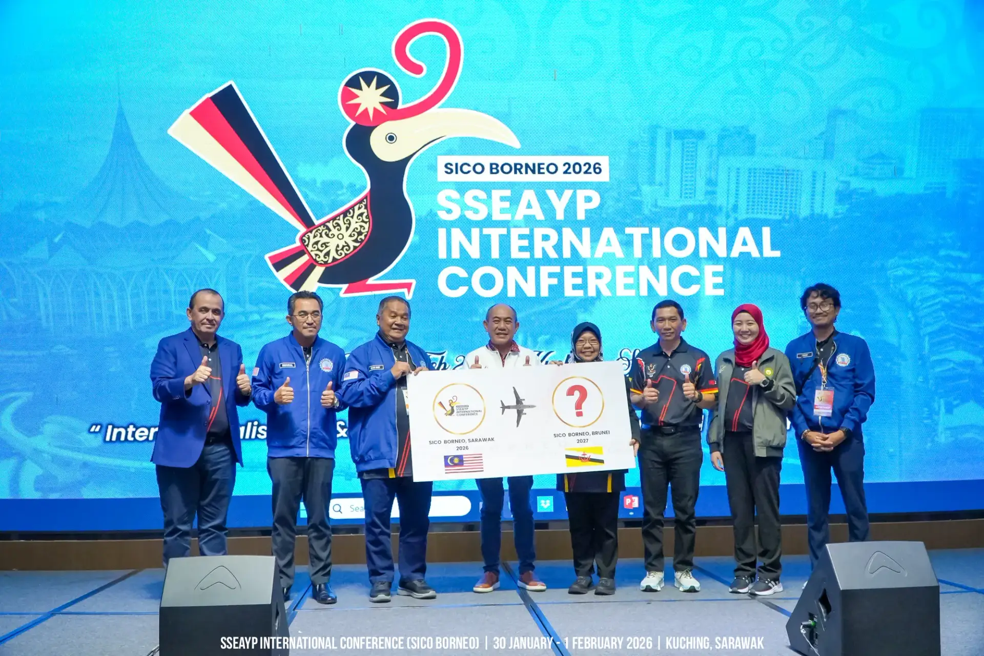
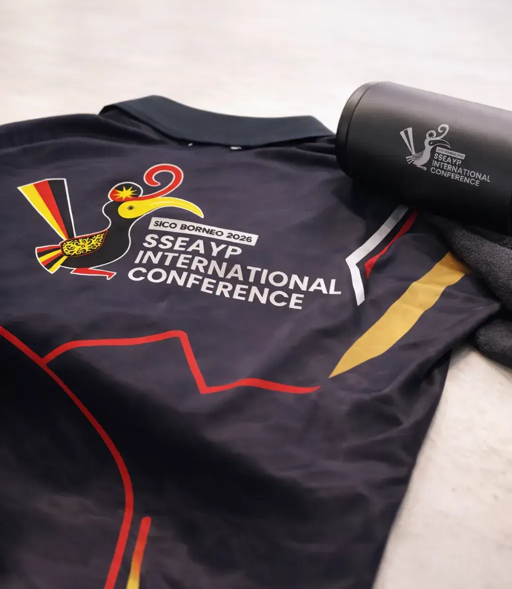
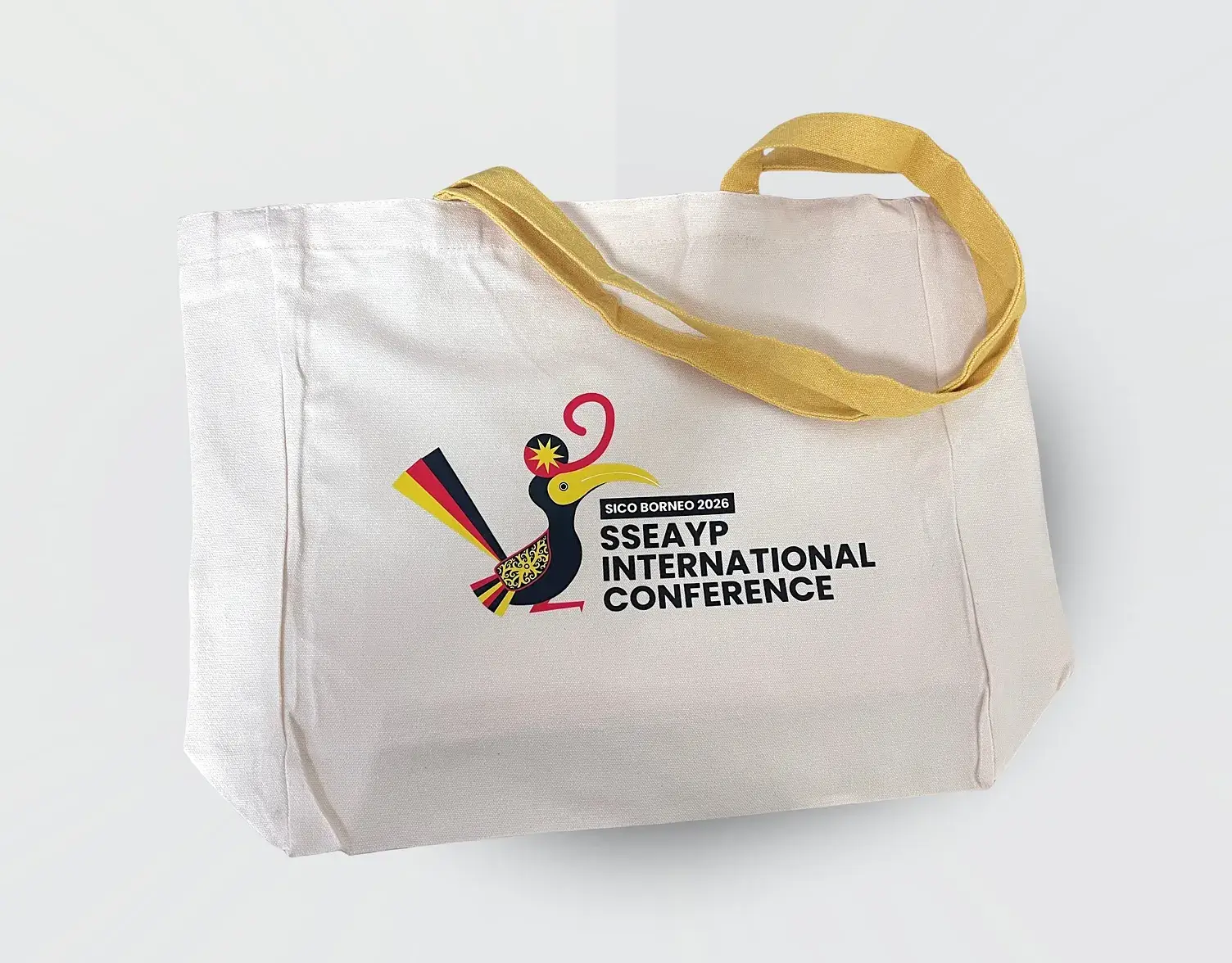
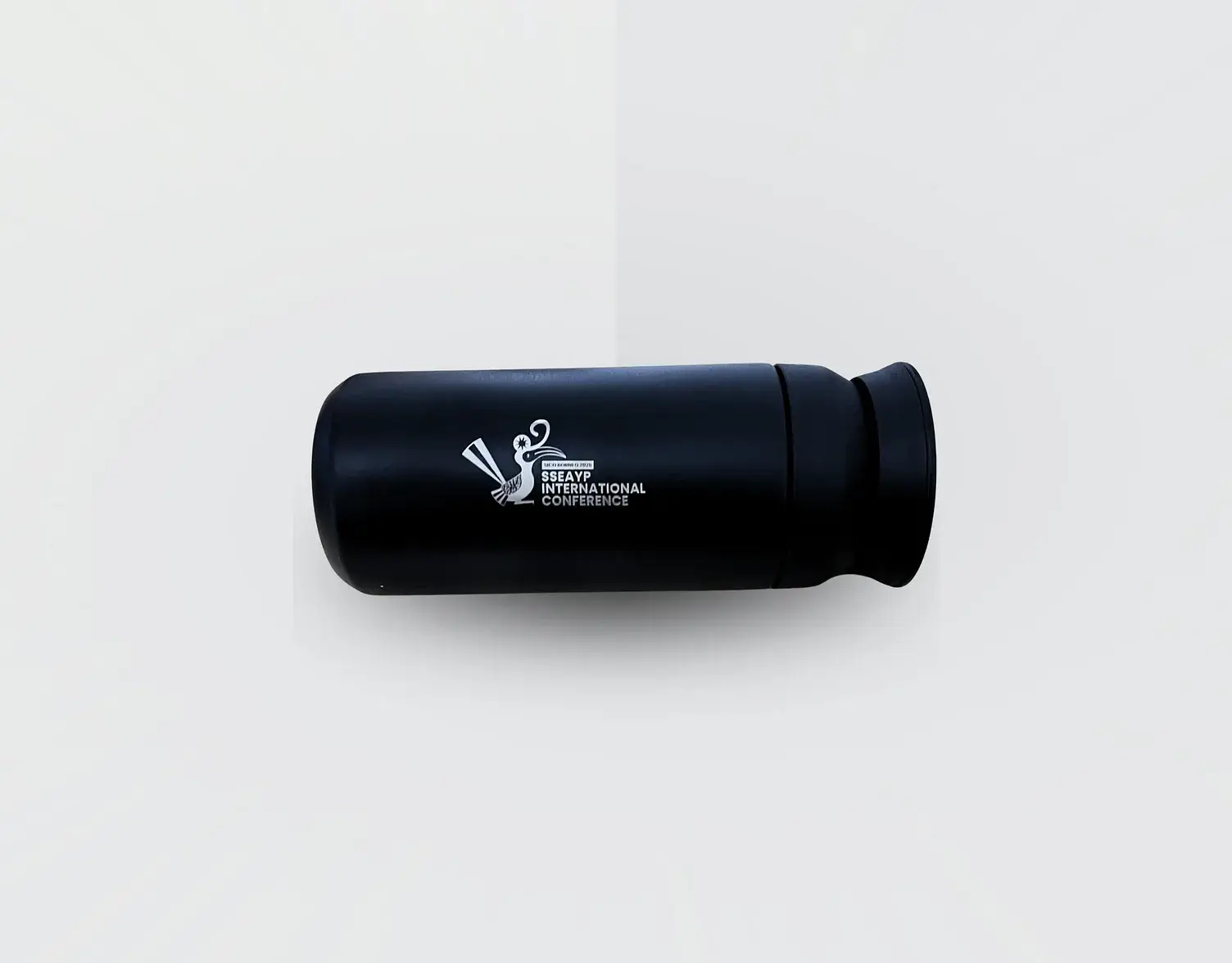
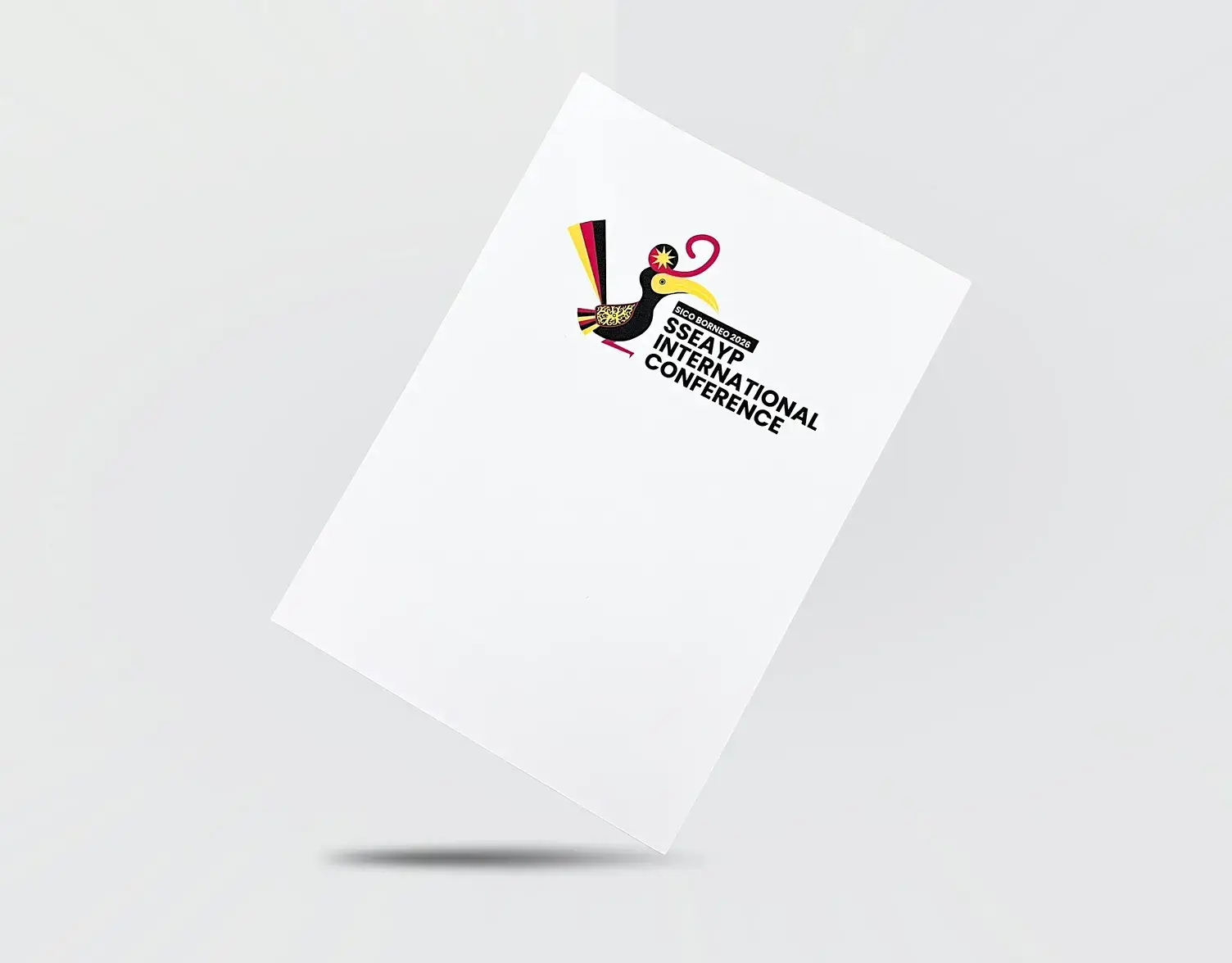
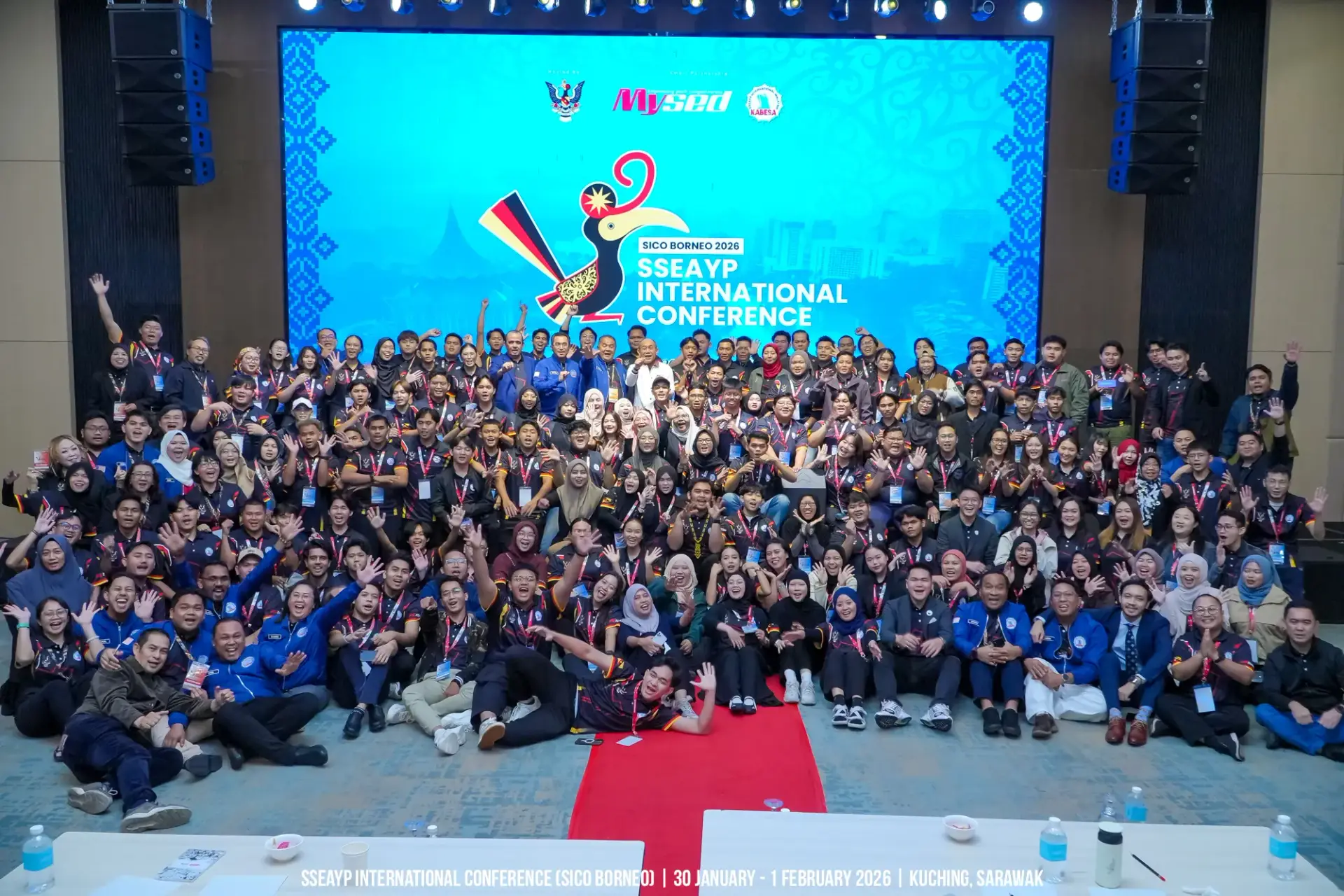
The selected logo became the event’s visual identity, appearing on official merchandise, printed materials and conference collateral. The applications show how the emblem carries across different formats.

The design was selected by YB Dato Sri Abdul Karim Rahman Hamzah, Sarawak's Minister of Youth, Sports and Entrepreneur Development, as the official identity of SICO Borneo 2026.

what we do

To Get There

01

discovery

Going deeper than a one-off event

I began by exploring the SSEAYP legacy, the people coming together and the role of Sarawak as host. The design direction needed to acknowledge both the place and the wider community.

This research shaped an emblem that brings local heritage and a shared regional spirit into one identity.

02

Shaping the mark

Motif and Hornbill

The hornbill became the visual anchor of the mark, connecting the identity with Sarawak. Through sketching, I explored how the bird’s form and surrounding decorative elements could read as a single emblem.

Each iteration refined the silhouette and balance, keeping the symbol recognisable across event applications.

03

Rooted in red, yellow, black

Color drawn from the Sarawak flag

The red, yellow and black palette draws from the Sarawak flag, connecting the conference identity with its host state.

Using this familiar combination gives the emblem a clear local reference across print, merchandise and event materials.

key takeaway

To Remember

A cultural identity needs thoughtful research as well as a recognisable shape. This project brought Sarawak’s symbolism into an emblem designed to represent a shared gathering and work consistently across its materials.