Flos Esto connects personal growth with the idea of blooming. Its Kuching-based Mind Institute offers personal development programmes and corporate training, while Flos Té brings the same brand story into flower tea.
I redesigned the logo and designed and developed the website, bringing the identity, programme information and enquiry journeys into one consistent experience.
My role: Logo redesign · Website design & development
Deliverables: Logo system, brand guidelines, responsive website, interactive self-reflection and programme enquiry journeys.
The finished project brings the redesigned logo and website together in one consistent presentation. Visitors can explore the institute, reflect on their own goals, review the training levels and find the appropriate enquiry route.
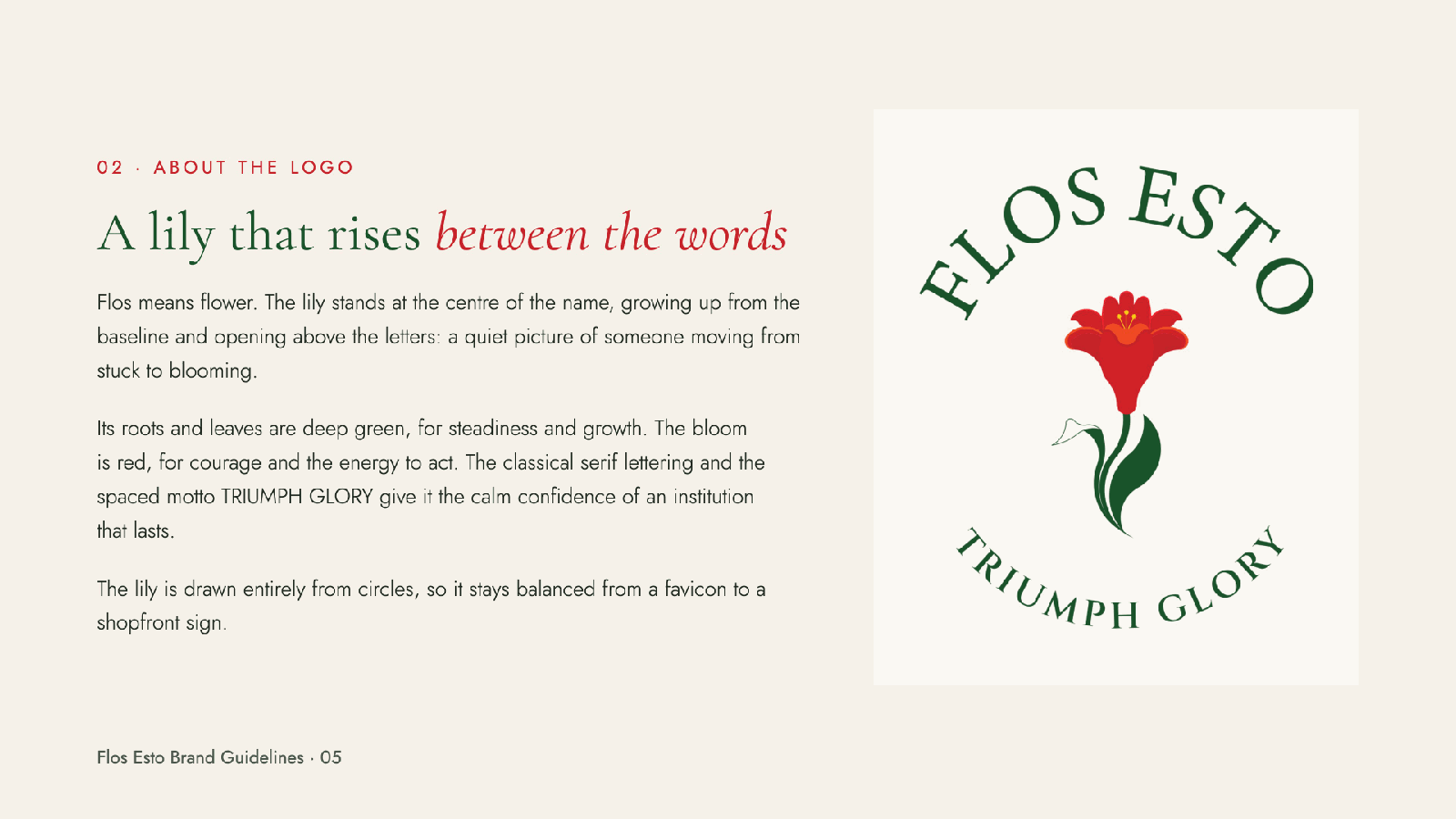
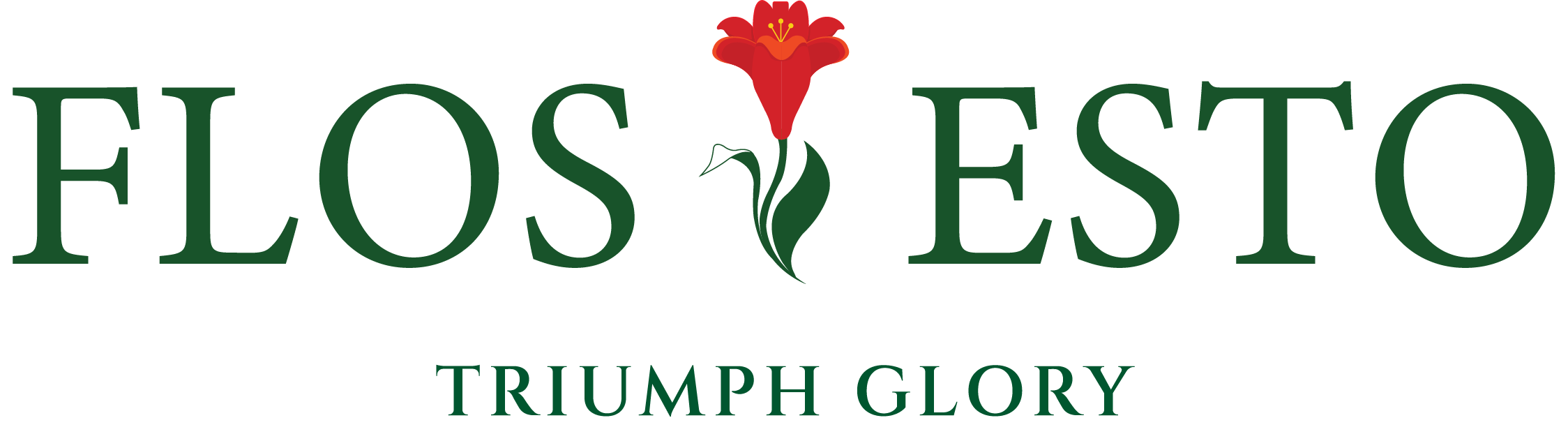
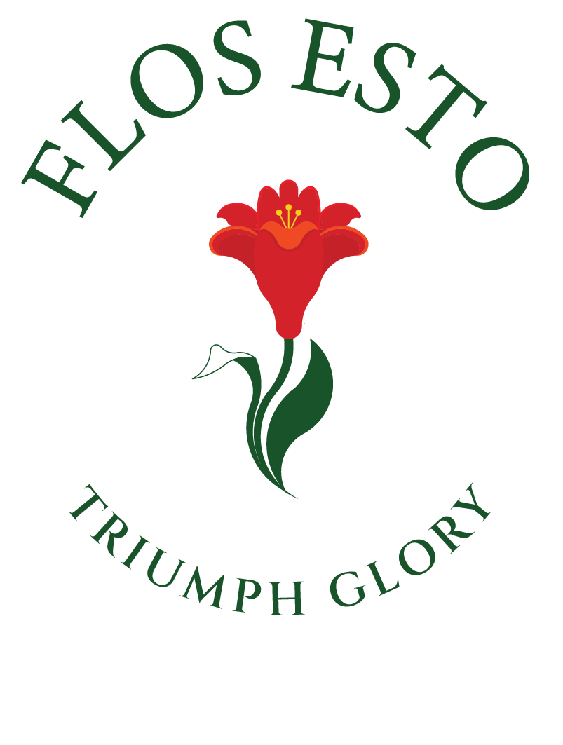
I redesigned the Flos Esto logo around a lily rising between the words: a visual expression of moving from stuck to blooming. Deep green grounds the identity in steadiness and growth, while the red bloom brings courage and energy.
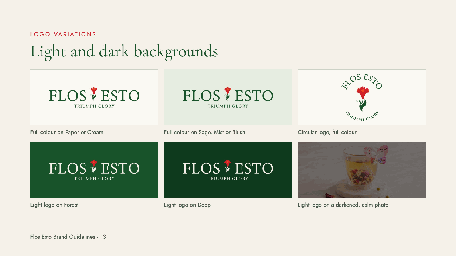
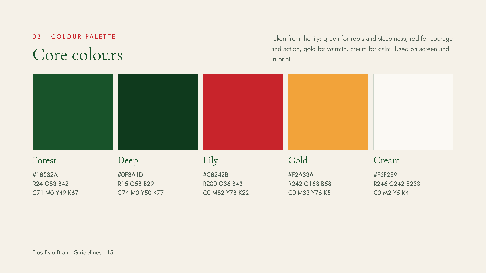
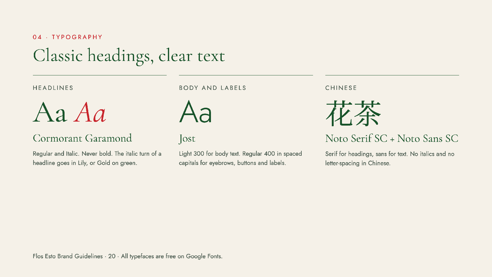
The identity extends across the master brand, Flos Esto Mind Institute and Flos Té. The brand guidelines document the horizontal and circular logos, clear space, colour balance and typography, helping the family stay consistent across digital and print.
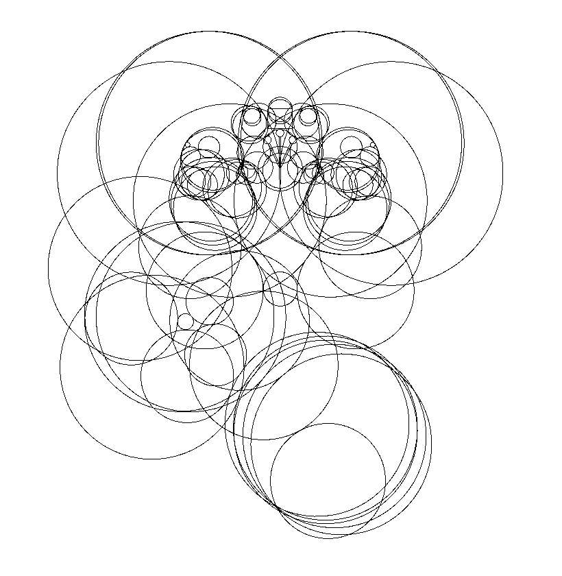
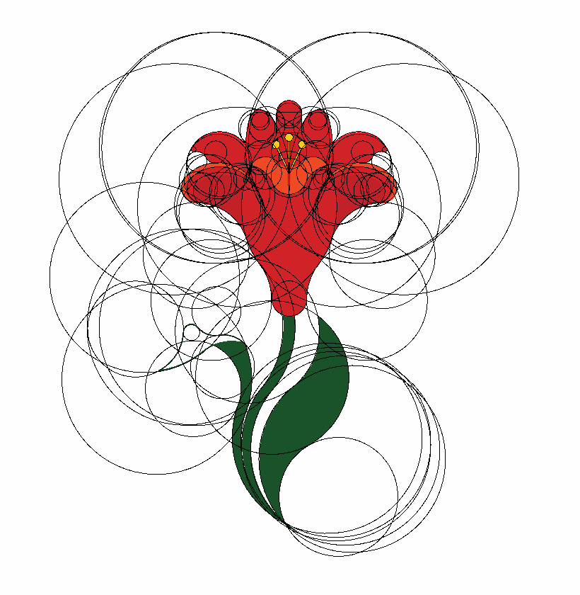
Overlapping circles map the curves of the petals, stem and leaves. These construction studies show the relationship between the underlying geometry, colour application and finished artwork.


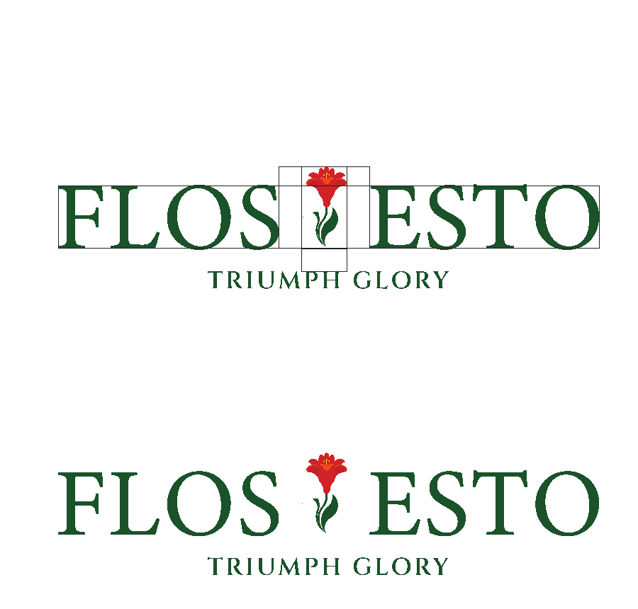
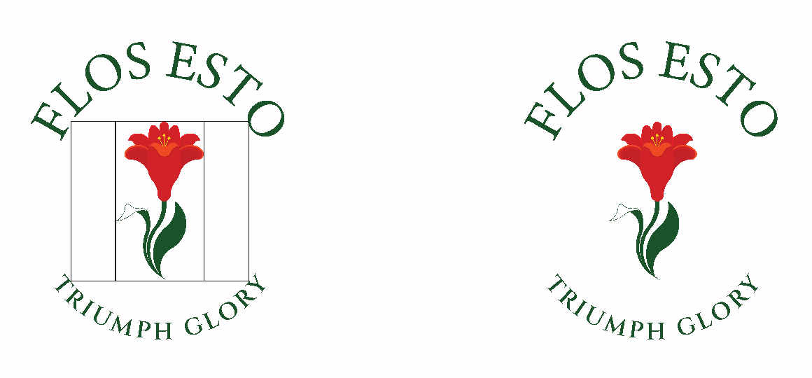
Proportion studies show how the lily sits alongside the lettering in the horizontal logo and within the circular emblem.
Minimal stickman illustrations turn ideas about growth, habits and self-reflection into familiar visual moments. Simple gestures and everyday situations help explain the message without filling the page with text.
A simple visual language for reflection, choices and moving forward.
The same visual language comes to life through animation, giving each idea a clear sequence to follow. Paired with concise wording, it keeps website content and presentations approachable and focused.
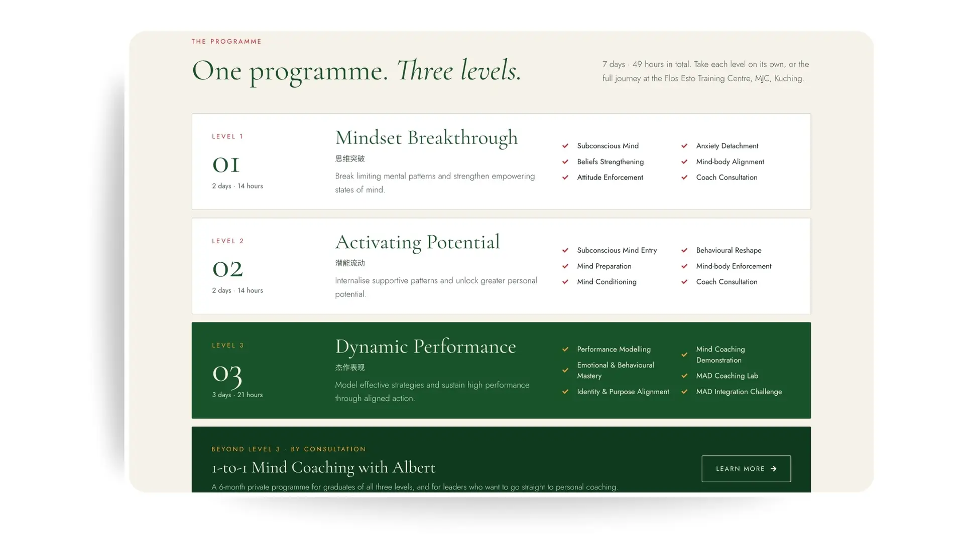
The programme is presented as three distinct levels, with durations, topics and next steps visible together. This structure helps visitors compare the options and understand how the full journey fits together.
Dedicated training and coaching information supports a more informed enquiry.
Individuals exploring personal development and companies seeking team training have different questions. The website provides dedicated routes for both, with programme enquiries for individuals and a corporate proposal request for businesses.
A brand story becomes useful when visitors can connect it to their own needs. This project combines a redesigned logo, a consistent visual identity and clear website journeys to help people explore Flos Esto and take the next step.