The Spark to Protect, the Drive to Grow

A Great Eastern insurance team helping families in Borneo prepare for whatever life brings.

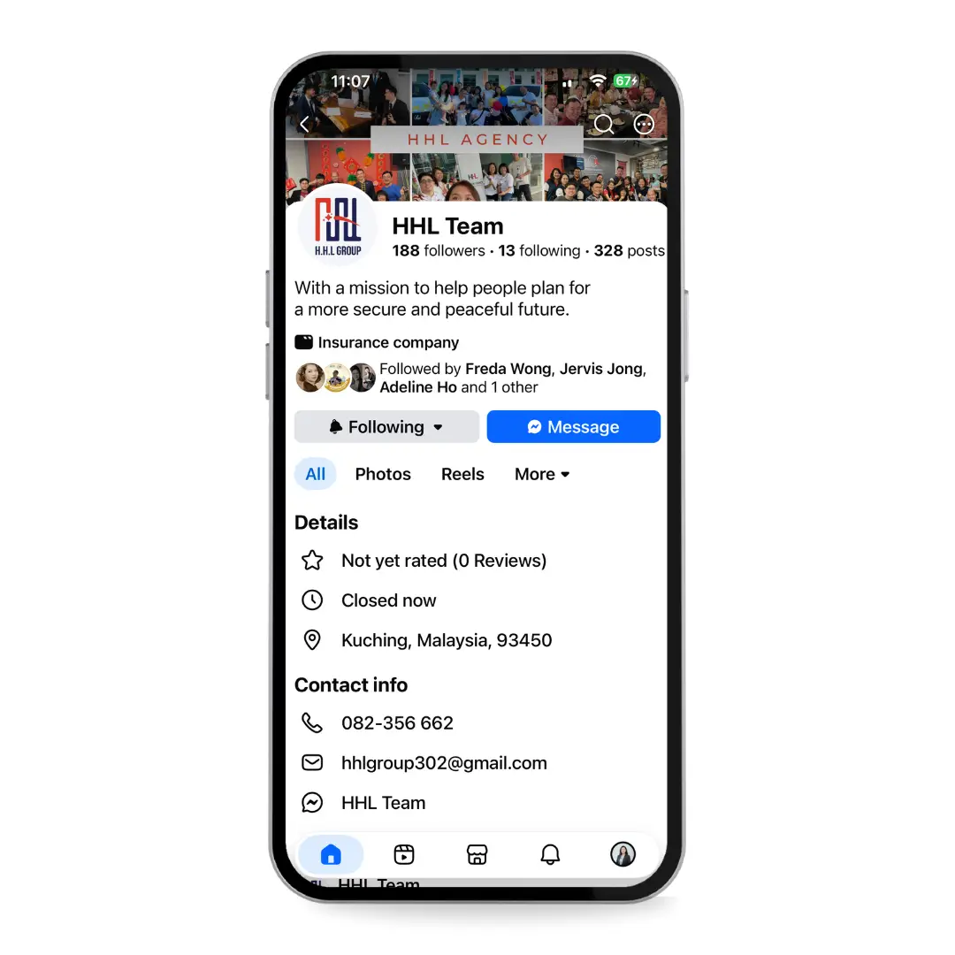
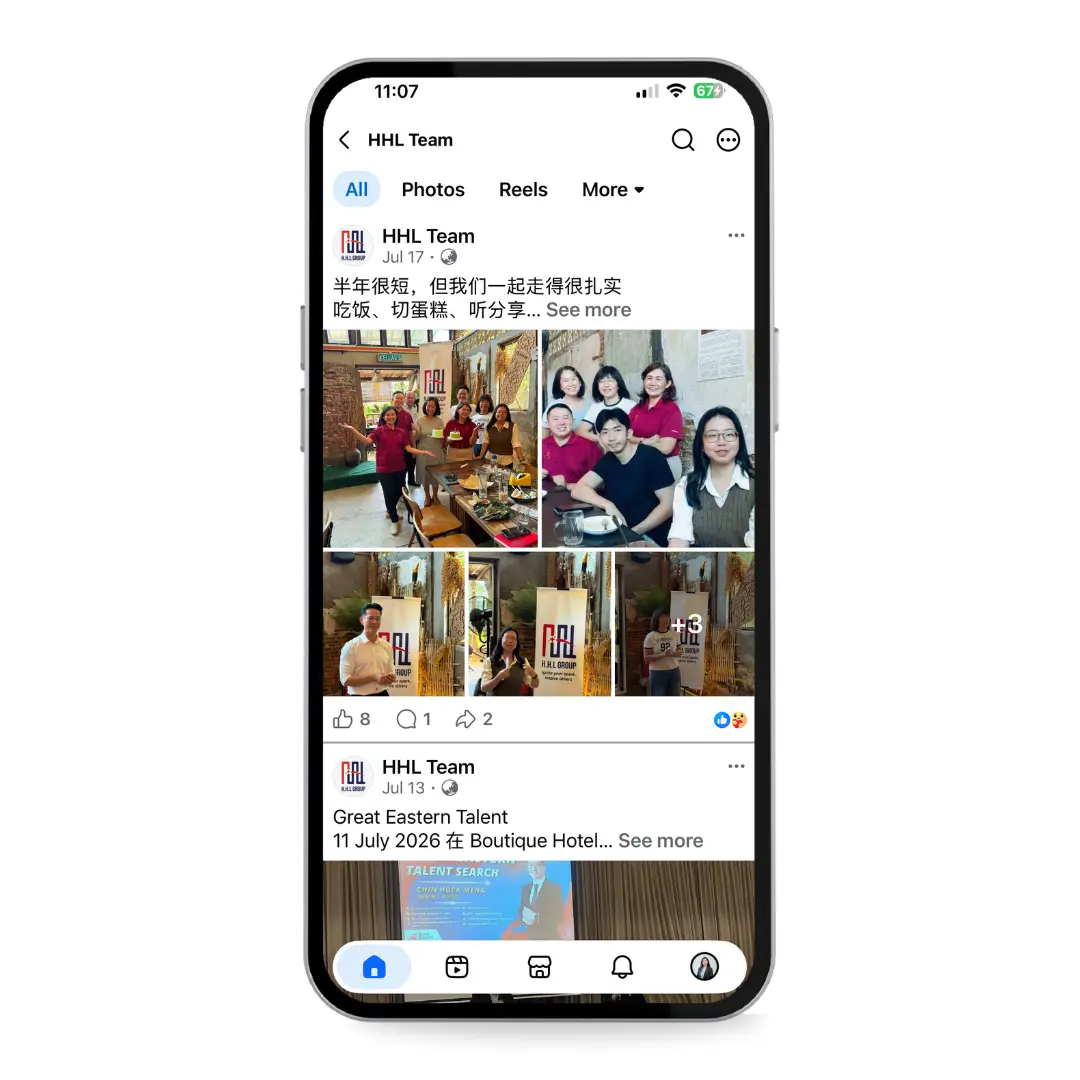
HHL Group is a team of life planners under Great Eastern, helping families in Borneo prepare for life’s uncertainties. Their identity needed to express both the reassurance they offer clients and the energy of a growing team.

I developed a complete visual identity around those two qualities, from the logo and colour palette to typography and brand guidelines.

My role: Brand strategy and identity design.
Scope: Logo, colour system, typography, usage guidelines and brand applications.

the outcome

The finished guidelines bring the identity into one practical system: logo construction and variations, colour values, typography, usage rules and examples across merchandise, office collateral and social media.

HHL can use the same visual language across everyday materials, from a name card to a signboard.

Inside the brand guidelines

Selected pages showing the logo concept, colour palette, typography and stationery system. Tap a page to view it in detail.

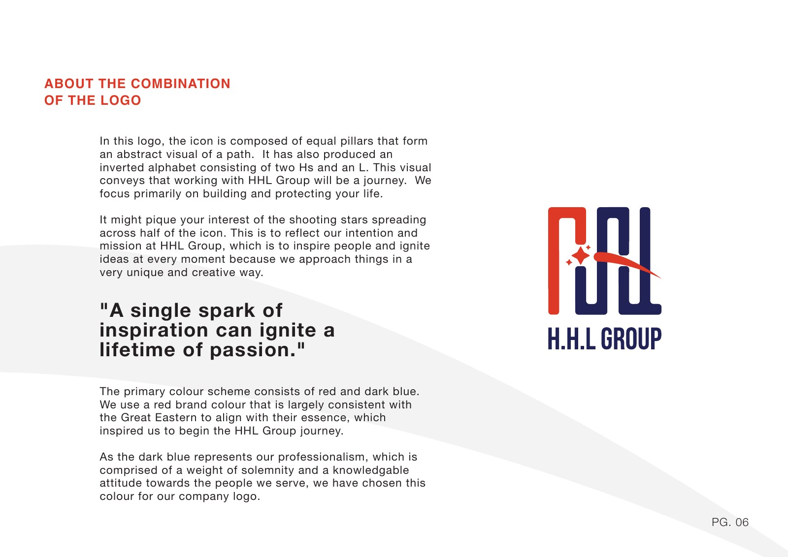
HHL Group brand guidelines — Logo concept
Logo concept
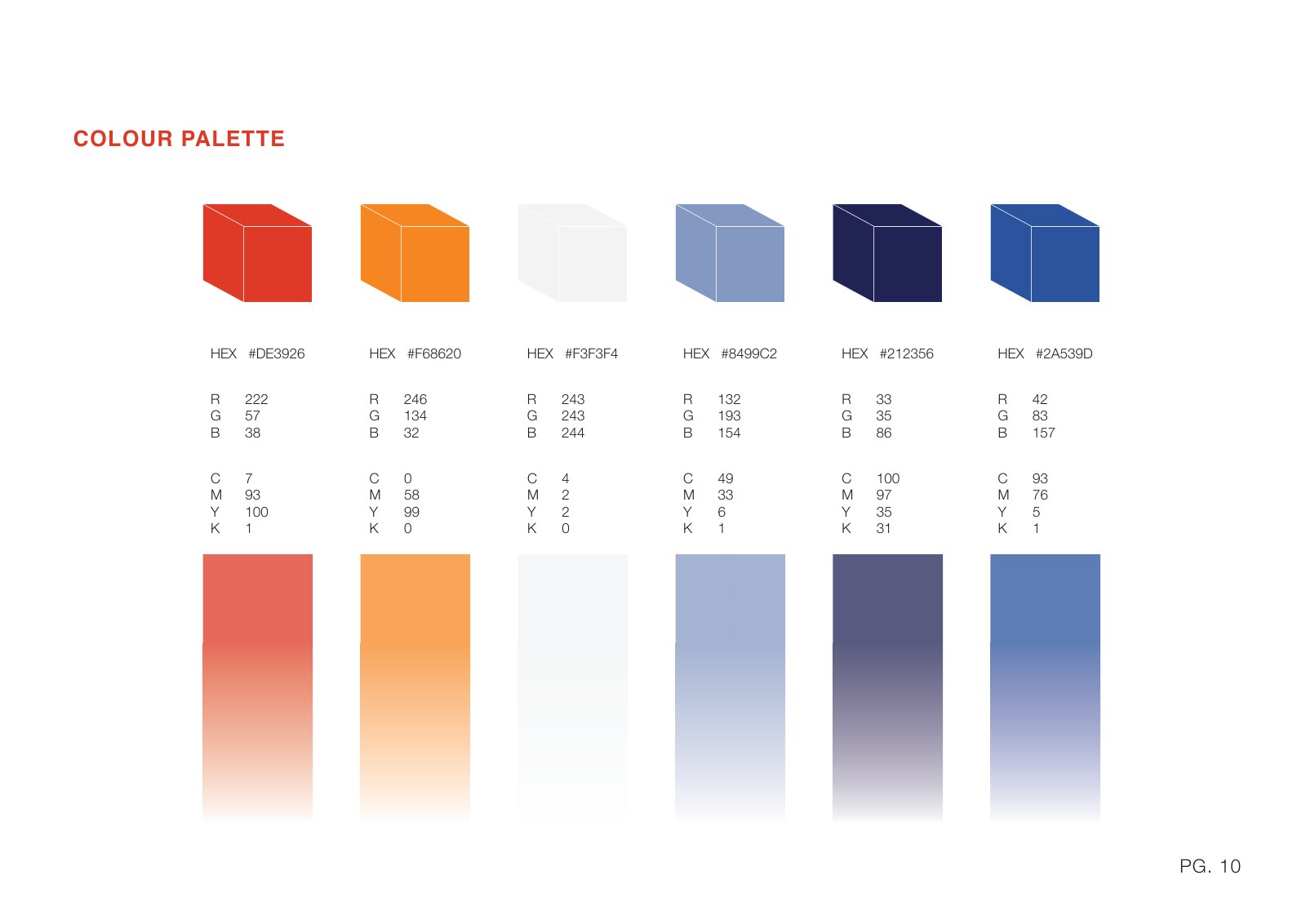
HHL Group brand guidelines — Colour palette
Colour palette
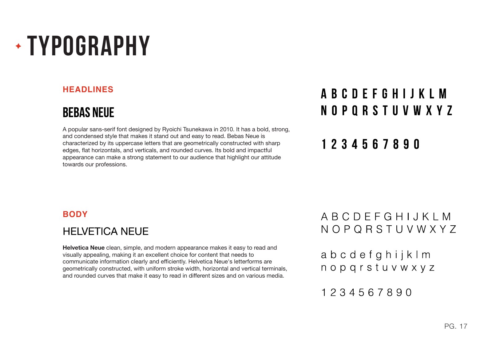
HHL Group brand guidelines — Typography
Typography
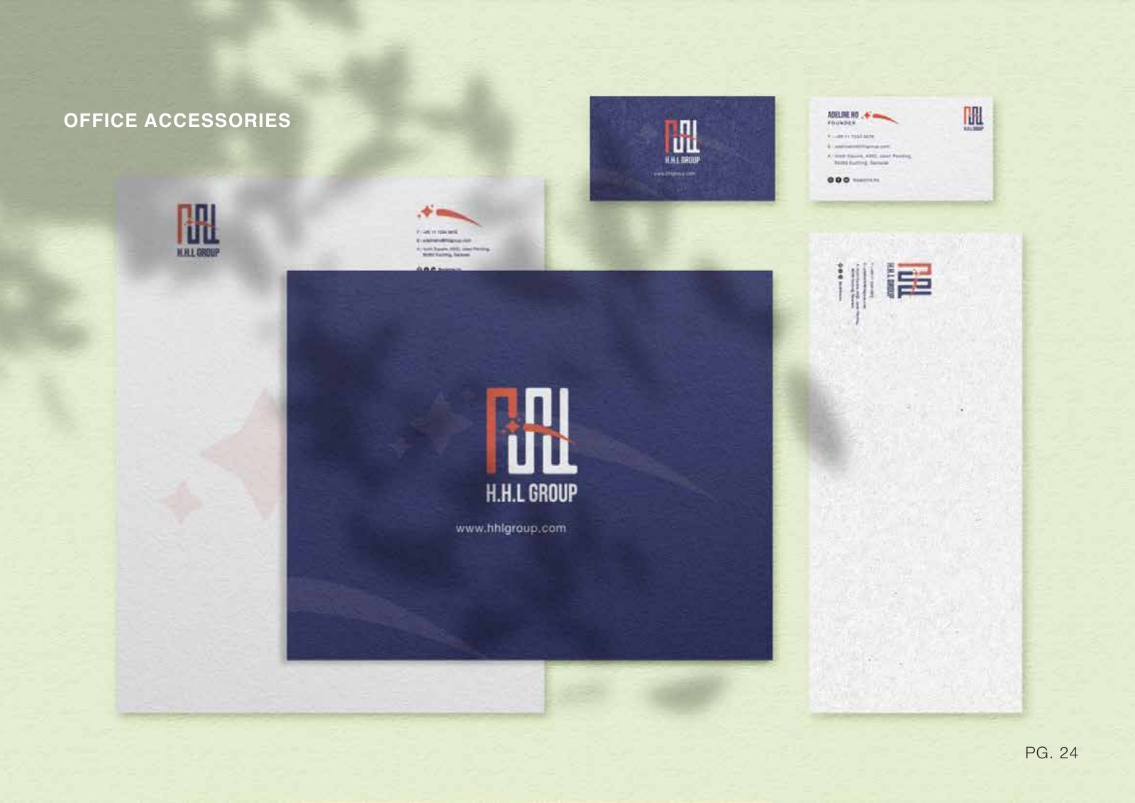
HHL Group brand guidelines — Stationery applications
Stationery applications

View the full brand book (PDF) ↗

with love

Hear from Adeline

what we do

To Get There

01

discovery

More than initials on a page

Working with the team, I grounded the identity in three values: Helpful, Hopeful and Love. The aim was to create a mark that reflects what HHL stands for while acknowledging its connection to Great Eastern.

This gave the project a clearer direction than simply arranging the founder’s initials into a logo.

02

Shaping the mark

A single spark of inspiration can ignite a lifetime of passion.

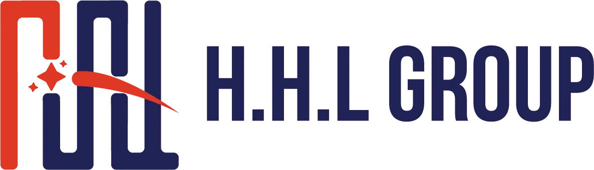
Equal pillars form an abstract path and an inverted H-H-L. The path represents the journey of building and protecting a client’s life, while the shooting stars introduce a sense of inspiration and momentum.

Together, these elements balance dependable support with the team’s ambition to grow.

03

rooted in red and blue

Colour aligned with Great Eastern

Red connects HHL’s identity with Great Eastern, while deep blue adds a calm, professional counterpoint. I developed the palette and its supporting tones to work consistently across print and digital materials.

The applications show how the system extends from stationery and signage to merchandise and team communications.

key takeaway

To Remember

A useful identity gives a team more than a recognisable logo. It connects their values to a visual system they can use every day. For HHL, the path and spark bring together reassurance for clients and a shared sense of direction for the team.