For the Malaysia-China Entrepreneur Macro Health Forum & Grand Asian Celebrity Charity Gala Night 2023, Fis Four designed two connected products: the public event website and the fundraising platform behind it. The work spanned UI/UX for the full donation experience and a website built to carry a high-profile gala — premium enough to match its celebrity and corporate guest list, clear enough to guide thousands of attendees. The goal throughout was to make giving feel effortless and the event feel every bit as considered as the occasion.
Role : In this project, Fis Four was responsible for the UI/UX and visual design only. Development and final launch were handled separately.
The whole platform was designed around a single action — funding in. Every screen removes friction between wanting to support someone and actually doing it, so a visitor never has to hunt for how to give.
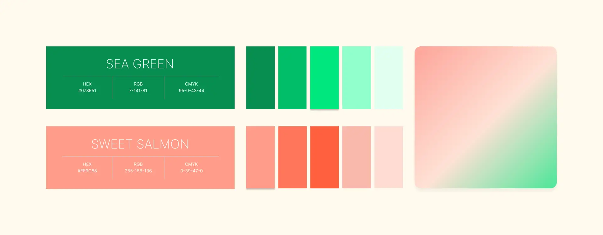
Forever GACC’s own green grounds the platform with the brand’s recognisable identity, but a project raising money for charity needed warmth too — so we introduced a soft coral as a second primary to carry the emotional, human side of giving. The green anchors the brand; the coral invites the action, colouring every prompt to fund in. From these two we built a full range of tonal variations, keeping the system flexible while every screen stays unmistakably Forever GACC.
One goal, many distractions
A charity platform can easily bury its most important action under navigation, information, and steps. The priority was clear: nothing should stand between a supporter and the celebrity they came to fund.
Emotional, in-the-moment giving
Supporters don’t arrive to browse, they arrive to back someone. The experience had to meet that impulse instantly, wherever it struck.
Two kinds of supporter
Some arrive knowing exactly who they want to fund. Others discover someone while browsing. Both needed the same frictionless path to giving.

We designed the platform so that funding is never more than one click away; from the homepage, from the celebrity page, from anywhere.
On the homepage, featured celebrities appear as cover cards. Clicking the one you want to support slides open a personal encouragement video from them, with a Fund Now button directly beneath — see them, hear them, give, without ever leaving the page.
A Fund Now button also stays pinned in the header across every screen, so anyone who’s already decided can act instantly. Two paths to the same action, by design: the header for the decided, the in-context button for the moved.
For supporters who want to see everyone first, the celebrity page lists the full roster. The same interaction carries through — click any celebrity to open their video and fund in on the spot. Whether someone arrives certain or curious, the path to giving stays identical and immediate.
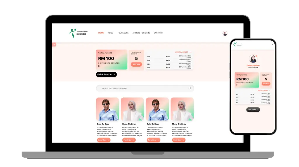
Funding had to feel just as effortless on a phone as on a desktop; most supporters, after all, would be giving from wherever they happened to see their favourite celebrity. The layout adapts fluidly between the two: the desktop version gives the encouragement videos and celebrity cards room to breathe, while the mobile version stacks them into a fast, thumb-friendly flow that keeps Fund Now always within reach. Same single-click path to giving, resized for the device in hand.
The hardest part of a charity platform isn’t showing information — it’s protecting the moment someone decides to give. Every design decision served that one goal.