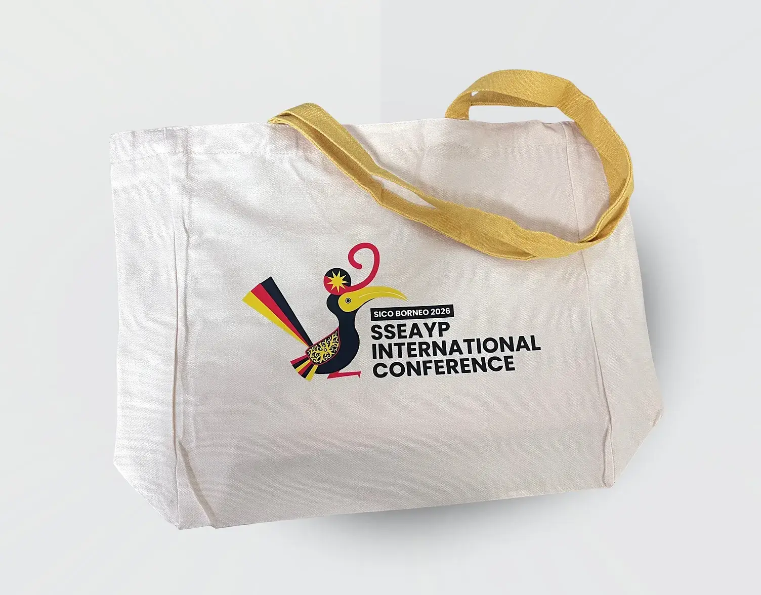
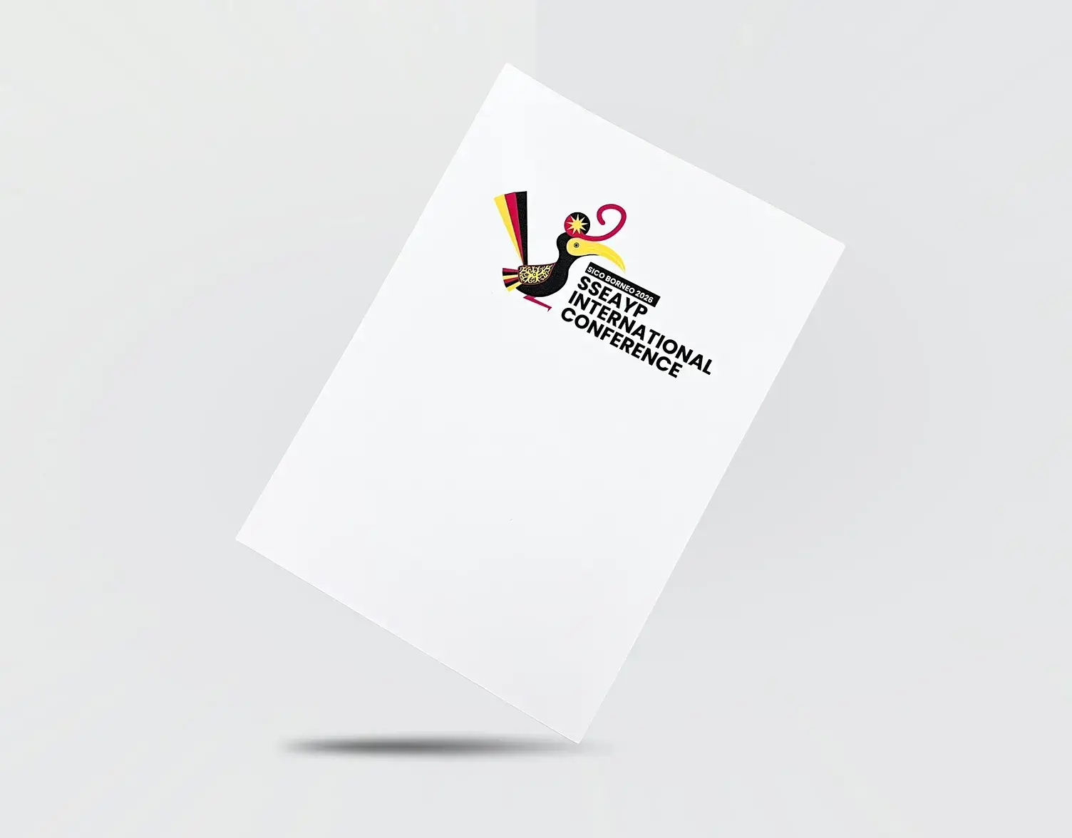
SICO Borneo 2026 SSEAYP International Conference

A regional initiative showcasing Borneo’s identity through curated design, merchandise, and on-ground experience.

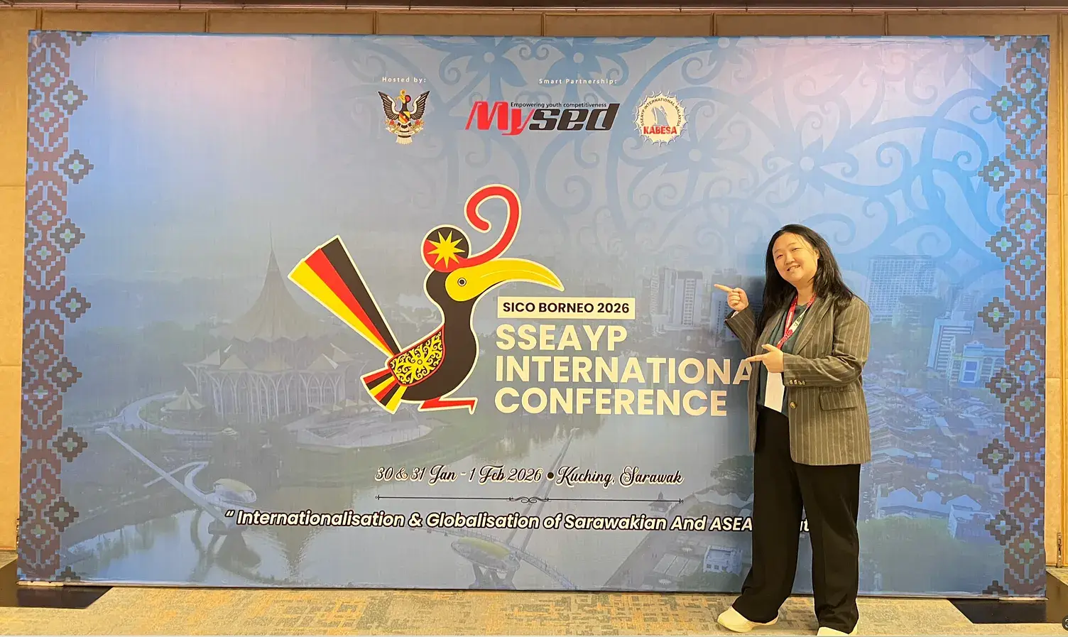
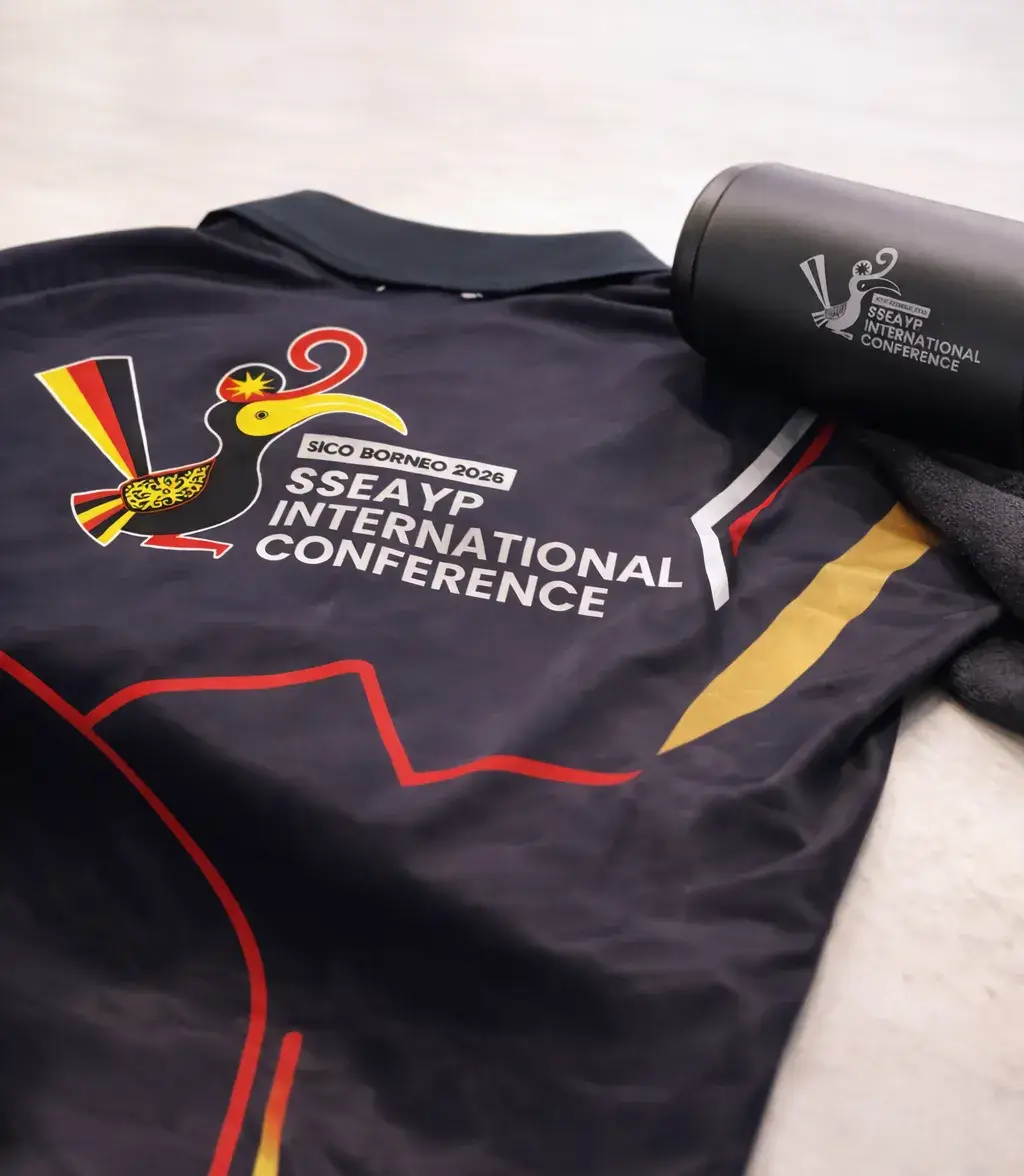
SICO Borneo 2026 is a regional initiative bringing together culture, youth, and commerce across Borneo. The project required a visual identity that reflects unity, heritage, and modern relevance. My role focused on crafting a logo that was ultimately selected and used across official event materials and merchandise.

the outcome

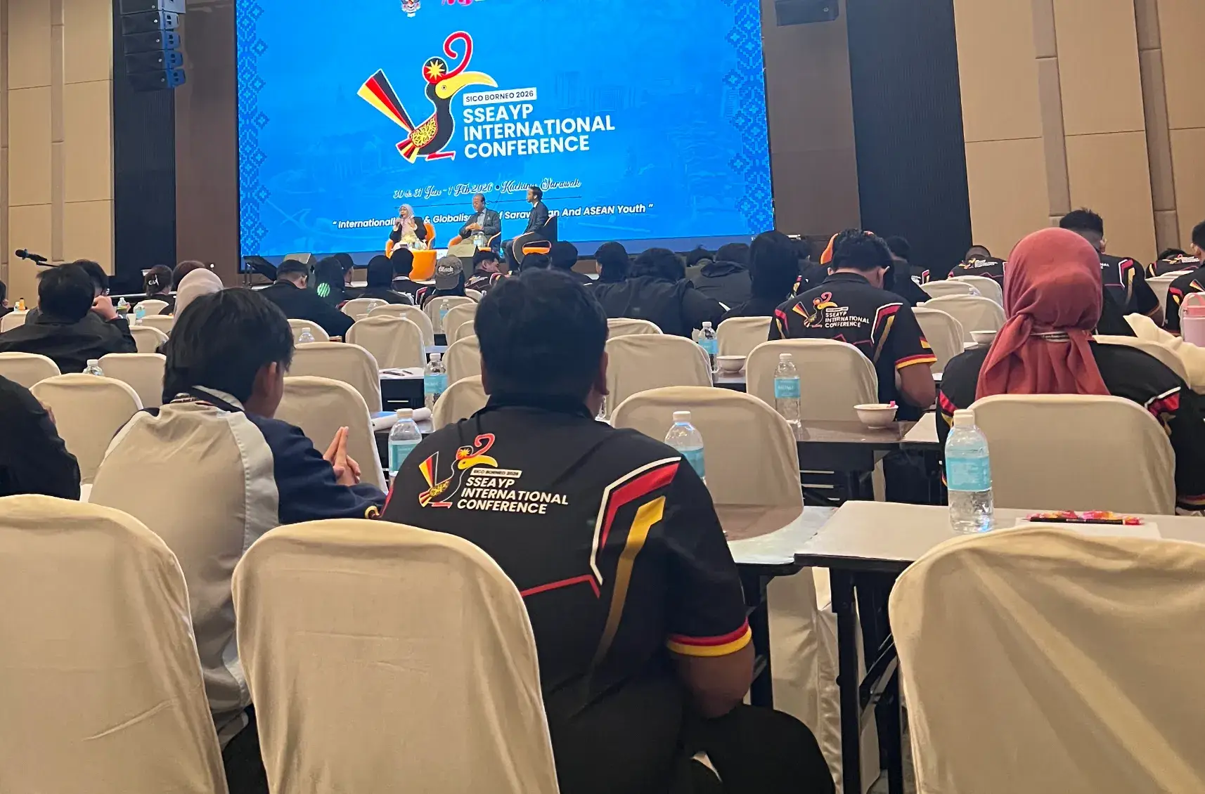
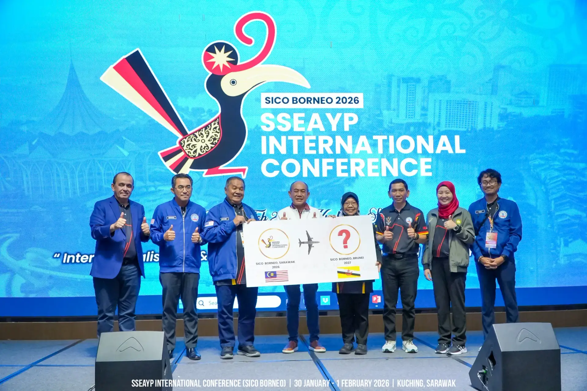
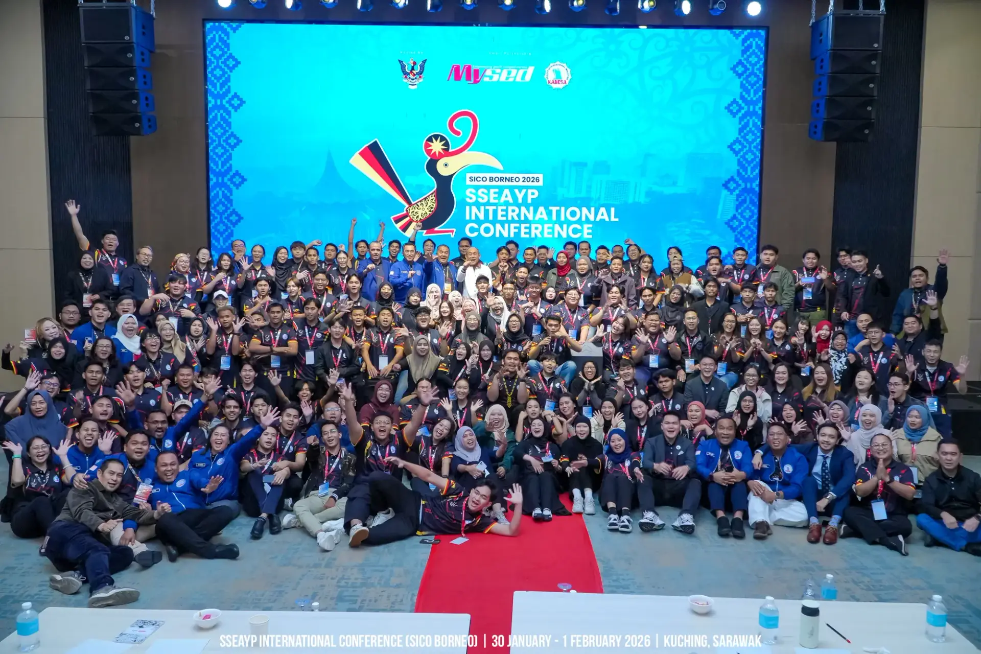
The logo became the visual anchor of the entire convention — appearing across official merchandise, printed materials, and event collateral seen by roughly 200 international delegates.

The design was selected by YB Dato Sri Abdul Karim Rahman Hamzah, Sarawak's Minister of Youth, Sports and Entrepreneur Development, as the official identity of SICO Borneo 2026.

what we do

To Get There

01

discovery

Going deeper than a one-off event

Rather than treating SICO Borneo 2026 as a single convention needing a single graphic, we began by defining what the identity had to sustain — a gathering meant to outlive its three days. We dug into the stories surrounding the event: the SSEAYP legacy, the delegates it would bring together, and the cultures meeting in one room. The direction that emerged was a combination of identities — an emblem where Sarawak’s heritage and ASEAN’s shared spirit could coexist in one mark.

02

Shaping the mark

Motif and Hornbill

From that foundation, we moved into sketching. The hornbill — Sarawak’s most recognisable symbol and the emblem of Bumi Kenyalang, the Land of the Hornbills — became the visual anchor, representing the host state welcoming the region. Around it, we layered in [traditional motif details — name the specific motif if you can, e.g., Iban pua kumbu patterning or Orang Ulu curves], weaving local craft language into the logo’s form. Each sketch iteration refined how the hornbill and motif could merge into a single, confident silhouette rather than sitting as separate decorations.

03

Rooted in red, yellow, black

Color drawn from the Sarawak flag

The palette comes directly from the Sarawak flag — red, yellow, and black — grounding the identity unmistakably in its host state. Red carries the courage and determination of the people, yellow the state’s dignity and its natural wealth, and black the deep resources and strength of Sarawak. Using the flag’s own combination meant the logo didn’t just represent the convention; it represented where the convention stood.

key takeaway

To Remember

Sarawak’s heritage with ASEAN’s shared spirit had taught me that a strong emblem doesn’t pick a side; it finds the shape where both feel at home. Cultural symbols carry weight that the hornbill and flag colors weren’t decoration, they were the design’s entire argument. When a mark represents a place, research isn’t a phase; it’s the concept. Designing one moment in a 50-year programme’s history taught me to balance two clocks: the mark had to feel current for 2026, yet dignified enough to sit in SSEAYP’s archive forever.