The Spark to Protect, the Drive to Grow

A Great Eastern insurance team helping families in Borneo prepare for whatever life brings.

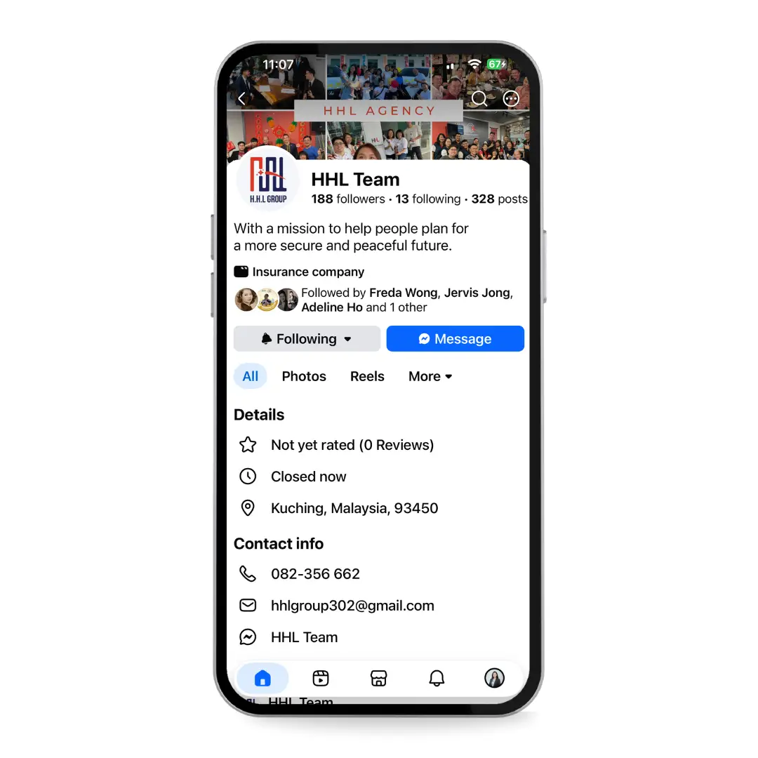
HHL Group is a team of life planners under Great Eastern, built on a shared purpose: helping people prepare before hardship strikes. They saw how quickly an unexpected event; especially around health can leave a family emotionally and financially devastated, and set out to make sure the people they serve are ready instead. Fis Four designed the complete brand identity: a logo, colour system, typography, and full guidelines that carry both the care HHL gives its clients and the spark that drives its growing team.

the outcome

A complete brand identity delivered as a full guidelines book. The logo and its construction, primary and secondary variations, a defined colour palette, typography, usage rules, and applications across merchandise, office collateral, and social media. One consistent system HHL can carry across every touchpoint, from a name card to a signboard.

with love

Hear from Adeline

what we do

To Get There

01

discovery

More than initials on a page

HHL could have been a logo built from the founder’s name and left at that. It needed to mean more. Working with the team, we anchored the identity to what they actually stand for being Helpful, staying Hopeful, and above all leading with Love and to their place under Great Eastern. The brief that emerged wasn’t “draw the letters HHL,” it was “make a mark that reminds the team, every day, of the goodness they exist to spread.”

02

Shaping the mark

A single spark of inspiration can ignite a lifetime of passion.

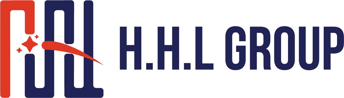
The icon is built from equal pillars that form an abstract path and, read together, an inverted H-H-L. That path signals what working with HHL feels like: a journey, focused on building and protecting a client’s life. Across the icon runs a scatter of shooting stars and the spark representing HHL’s intent to inspire and ignite at every moment. It’s a mark that carries both halves of the brand at once: the steadiness of protection, and the energy of a team on the rise.

03

rooted in red and blue

Colour aligned with Great Eastern

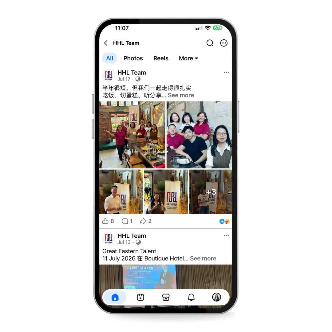
A brand only proves itself once it leaves the guidelines and starts showing up in real life. HHL’s identity was built to travel from a name card to a signboard to a team photo without ever losing itself. The red keeps it aligned with Great Eastern, the parent brand that started HHL’s journey; the deep blue carries the professionalism clients trust. But the real test came when the team began using it: on merchandise they wear with pride, across the moments they share, in every post that marks who they are. That’s when a logo stops being a design and becomes an identity; the mark the team rallies behind and the public learns to recognise.

key takeaway

To Remember

The strongest brand marks don’t just identify a company — they remind the company who it’s trying to be. HHL’s logo isn’t the founder’s name dressed up; it’s a path, a spark, and a reminder to keep spreading the goodness the team was built on. When a brand stands for protecting people, the identity has to carry both the reassurance clients need and the energy the team runs on — and the best mark holds both without choosing.